Welcome to part 1 of the CSS Tricks series for beginner front end developers. This series of articles I will summarize the “trick” in the CSS that I have ever heard, read and felt very helpful. Hope to be valuable for you, especially for those new to html, css and javascript.
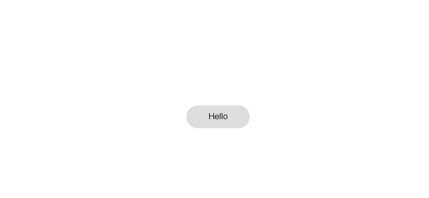
1. “Fill color” with text elements
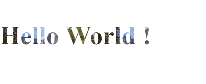
This effect allows you to “fill” (I don’t know what word to use properly) for text with images, videos, or color attributes that the color attribute does not support, such as linear. -gradient, radial-gradient, ….
Example of the above effect:
The snippet code is as follows:
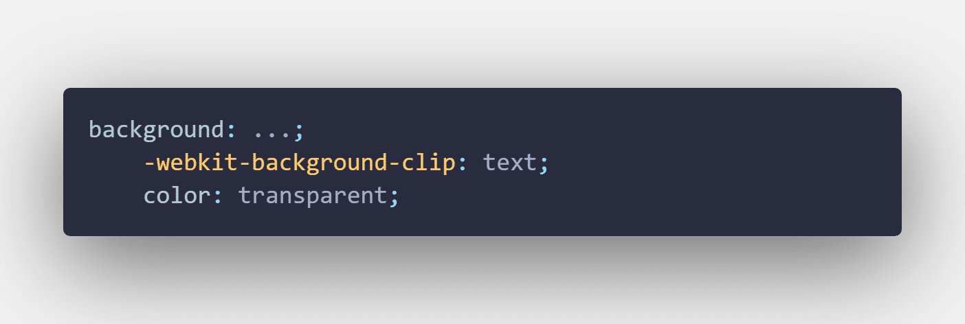
In the background you can use an image, video, linear-gradient, radial-gradient, … to make the effect more eye-catching.
2. Round the border
Surely you do the front end also have to do the buttons / links with rounded borders like this.
Normally, what is the solution you think of first? Probably the easiest is border-radius: … px already. But changing the sign … that’s how much is enough. When I first learned, I started to crack open the dev tool and then started editing until it was round. : D Actually to be able to make this rounded very simple, the key here is that you have to set it to a value large enough, because you notice that, if you keep increasing the border-radius, At one point, when the threshold is rounded, nothing will change. So, just set the border-radius 1 value big enough that the button will automatically rounded regardless of its padding, width, height. I often use border-radius: 999px. Because I think it is big enough, beautiful and easy to remember.
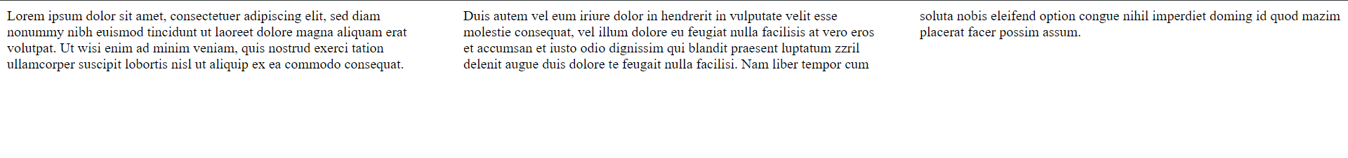
3. Divide the column by text content
CSS allows you to define the content of an element into columns and the space between them.
For example like this. Here I divided into 3 columns, each column is 40px apart.
The code snippet looks like this:
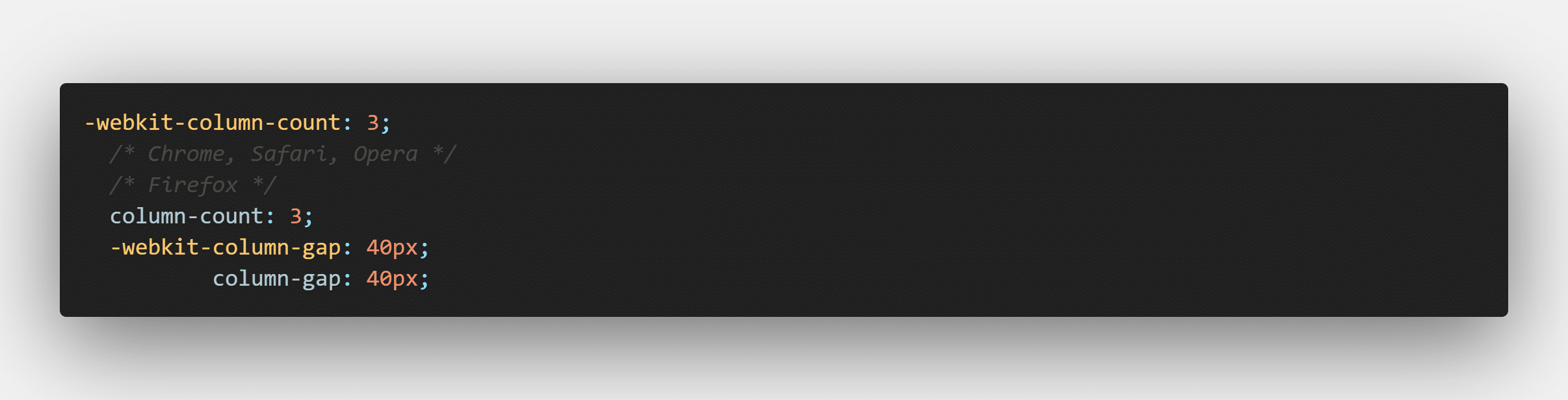
column-count is the number of columns you want to divide, column-count is the distance between columns.
4. Parallax Image
Parallax Image is an eye-catching effect and is increasingly favored by the design and front-end developers.
This effect simply means that the image does not move when the user rolls the mouse, the parallax image will look like a div, but it will move and it will be still. Here is a simple example of this effect.
HTML:
Although it looks complicated, this effect is easily implemented unexpectedly with only one css line. Just set the background of the div and that image with the background-attachment: fixed and boom properties, we have a great parallax image effect for our website.
5. Object-fit for images
Have you ever encountered the situation where you want to assign a width and height to an image? By assigning a hard with and height to an image, you break the ratio of the image and then there is a high chance that your image will be distorted. One solution to this is to use object-fit. The two most used attributes are object-fit: cover and object-fit: contain. Use object-fit: cover, then the image will automatically be cut to keep the inherent aspect ratio of the image, plus the image will be cropped to automatically cover the width and height you define. This property has the disadvantage that it will cause your image to be cropped and zoomed, thus not displaying all the content of the image. In contrast, object-fit: contain will automatically shrink the image while preserving the aspect ratio of the image. Doing so, your image will retain the entire content as well as the ratio, but the downside is that this way the image will only satisfy the height, not the full width, the remaining width will be a space because you intend to.
You can alternating the example here to better understand.
6. Limit the number of lines of text
When it comes to the limit on the number of lines of text, many people probably think of using JS to do this. However, you can do it with pure CSS without the help of a single JS line.
The snippet for this is as follows:
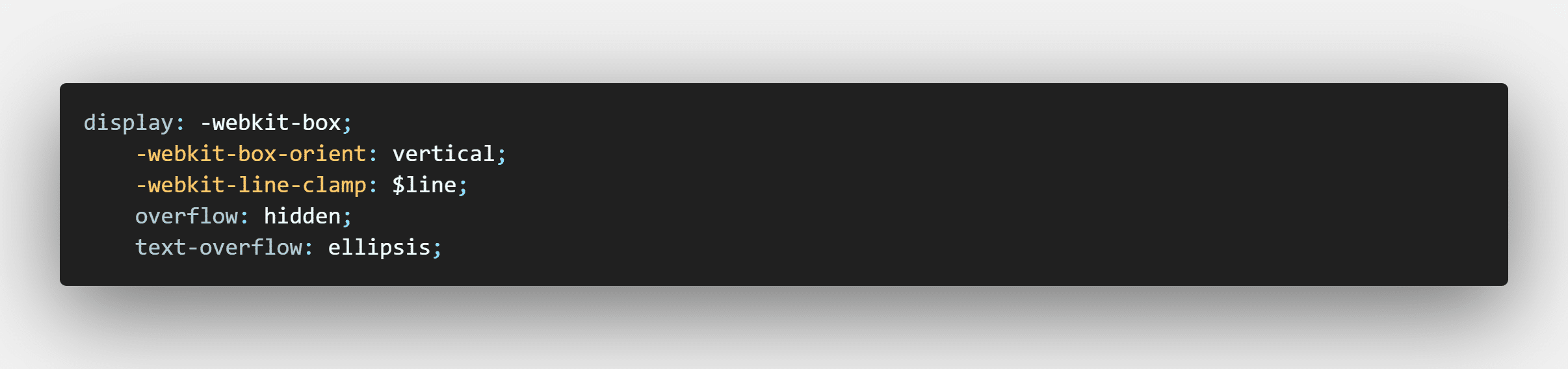
Here when using you replace $ line with the number of lines you want. The text-overflow attribute defines how the “redundant” text clipped is displayed. You can refer to here. In the above code I use ellipsis which means after cutting at the end there will be an additional ‘…’
See the example using the above code here.
Conclusion
On a side note, some of the properties for creating effects in some of these tricks may not be supported on all browsers or different versions of the browser. Therefore, you should consider and research carefully before using. You can use the website https://caniuse.com/ to look up before applying to your website.
Here I would like to end part 1 of the CSS Tricks series here. Hope it is helpful to you. I look forward to receiving comments and comments from you.